Whether you want to develop websites or games, you are likely to run into the problem of designing for multiple devices. You’ll have a page that looks great on a desktop but not on a phone or tablet.
One super easy way to look at the page without switching between devices is to use Google’s free developer tools.
Open your page in Google Chrome and then under VIEW, select DEVELOPER TOOLS. A new page will open showing your source code, etc. At the top of the page on the far left you can see two devices, a smaller one and a larger one. Click on that.

This will toggle your page between a larger screen view and mobile view.
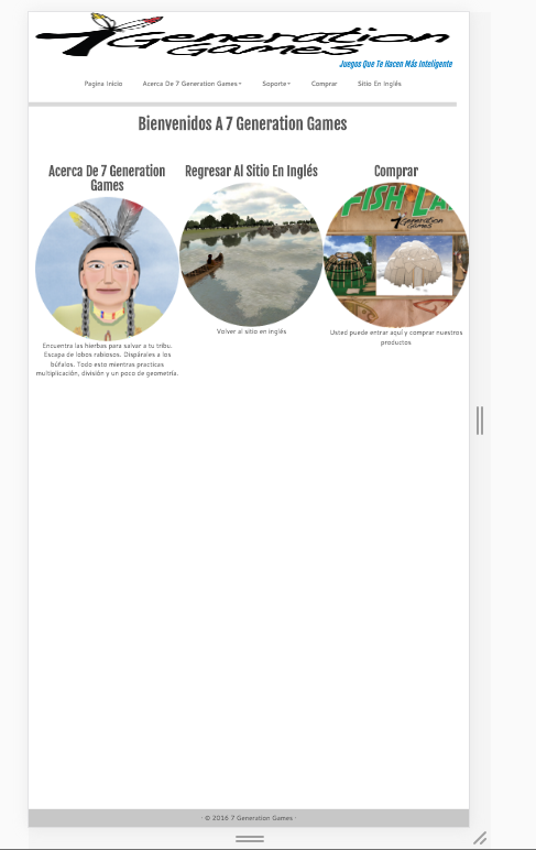
I decided for Hispanic Heritage Month, I would do something besides lip service and completely revamp our website in Spanish. It hasn’t been touched in a year and sorely needs it. On a mobile device, it looks like the image below, which is bad because I would like those images to be below one another.
I’m doing this between my 100 other tasks, but it will be much better in a month or so when I get it finished.
In the meantime, your tech tip for today – Google Chrome Dev Tools for the win.
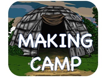
Speaking of Hispanic Heritage Month and mobile devices, you can get Making Camp Bilingual in the app store for iPads or play it on any Mac, Windows or Chromebook for only $1.99